Like any faithful item that paid its dues (a trusted denim jacket or the 1990 Sedan you inherited during your student days), brand design reaches the end of its shelf life. After 22 years, Khulisa proudly introduces a reinvented, refreshed brand.
Brand guru Seth Godin points out that good design is essential, but that design alone is not a brand. A brand he argues is the “set of stories, expectations, memories, and relationships that, taken together, account for a consumer’s decision to choose one product or service over another”.
As a pioneer in African M&E, Khulisa has built a collection of these “stories” and “relationships” over the last 20-plus years in business. More than 80% of our clients commission repeat projects – evidence that clients have a positive recollection of our work and trust us to meet their project expectations.
As these “stories” evolved, so did the face of our brand. We’ve adapted our services and methodologies to reflect new realities in M&E over the years, and came to a point where our brand identity had to do the same. We share five important considerations in this journey.
1. BRAND HERITAGE
Kicking off with the planning of the new brand, the first question the brand steering committee asked ourselves was, “What is the essence of the existing Khulisa brand?”
In our case, our strong standing as an African M&E firm was critical in the brand positioning, but our work and clients spanned further than the continent. Having recently opened an office in Washington DC, our brand personality (despite having its roots in Africa) had to reflect the global nature of our business.
2. MESSAGE
In response to the abovementioned evolution of our brand heritage, we asked ourselves what we want the new brand to say.
We brainstormed keywords and portrayed these visually in our new designs. They included concepts like trust, credibility, accuracy and consistency on the one end, and innovation, vibrancy and passion on the other.
3. LOGO – THE BRAND HALLMARK
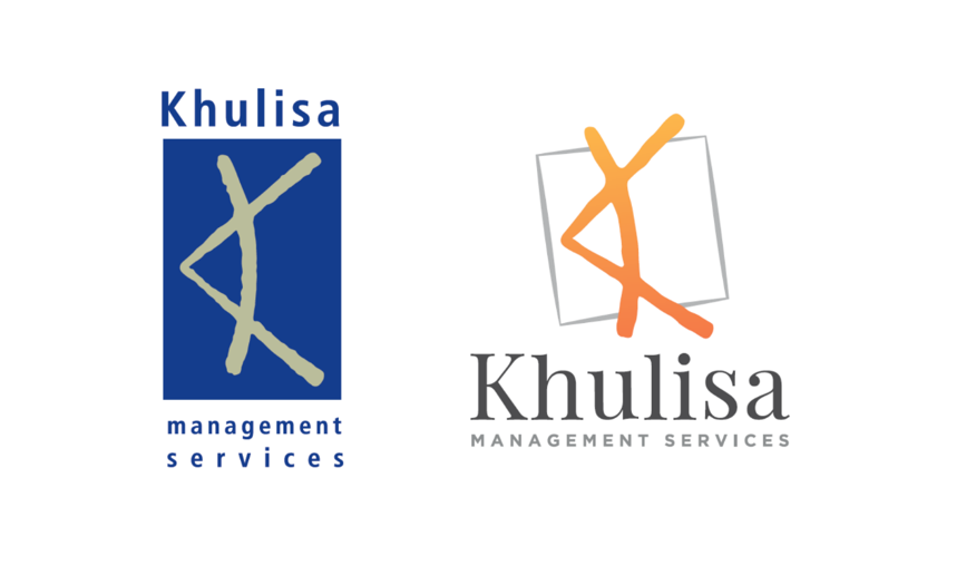
The Khulisa “K” is part of our company history and, like many other logos, the most recognisable element of our brand. It represents the African bow and arrow, an “eye” looking to the future, pushing new frontiers in our field.
Our team agreed not to do away with it. However, as our creative agency politely pointed out, we had tonnes of versions and formats flying around! We needed a standardised, modern design, reflecting our African-global context, while staying true to the K.
The end-product is a cleaner version of the K, positioned in a stylised box to form a “unit” as opposed to the current floating letter of the alphabet.
4. COLOUR
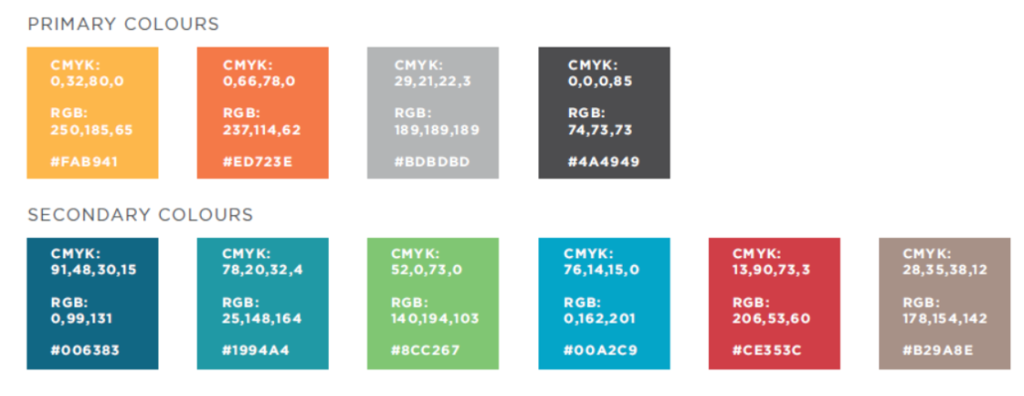
Exploring the psychology of colour was one of most exciting exercises of the rebrand. Online literature often references the use of blue as primary colour for consultancies and professional service firms. Our existing brand identity confirmed this dated trend.
Staying true to our core value of innovation, we decided to introduce orange – the opposite side of blue on the colour wheel – as our new primary colour. It’s vibrant, warm and in marketing terms, signifies action. In our secondary palette, we also pushed the envelope by introducing shades of teal, turquoise and yellow. The palette is lively, on trend and provides us with flexibility in our work as M&E professionals.
5. FONT
With the advertising wave that swept across the world in the 20th century, typography has developed into an art (and science) of its own.
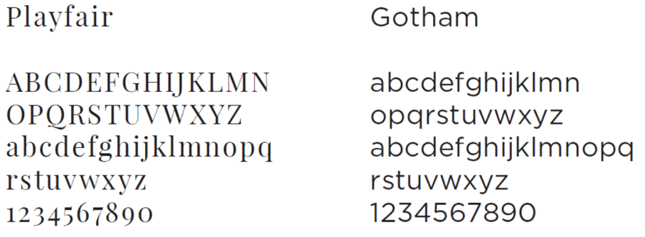
In Khulisa’s case, we considered the following: 1) A font that reflected the identity of a professional services firm – we chose Playfair; 2) A clean secondary font to support key messages, opting for Gotham; 3) A universal font, accessible in most font libraries for digital use, selecting the Georgia & Segoe family of fonts.
We have learnt tremendously during this branding exercise and give thanks to GMS who assisted with funding for our new brand and website; and to Markets Online, the digital agency responsible for web development and creative.


