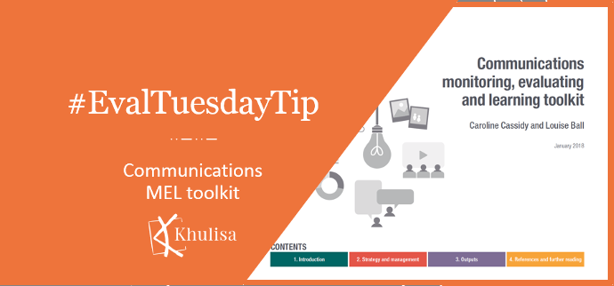
#EvalTuesdayTip: Communications MEL toolkit
Khulisa uses this Communications Monitoring, Evaluating & Learning (MEL) Toolkit to improve our communication practices and monitoring use and quality for several assignments.

Khulisa uses this Communications Monitoring, Evaluating & Learning (MEL) Toolkit to improve our communication practices and monitoring use and quality for several assignments.
Visualizing statistically significant p-values is often tricky. Khulisa recommends these tips these tips by Ann K. Emery on communicating statistical significance to non-technical audiences.
Khulisa recently started to use the excellent MEASURE Evaluation Gender and M&E toolkit funded by USAID. If you need inspiration and selling points on the importance
Khulisa is often asked to evaluate advocacy or other activities that are intended to change attitudes or behaviour. This free resource summarizes Methodologies for measuring
Khulisa recommends this free toolkit from the Spark Policy for Institute developmental evaluations.
Khulisa finds Acumen’s Lean Data approach useful in cases where time constraints and data volumes affect data collection and analysis. Acumen’s website has a variety
Khulisa is using E-valuate app which usefully provides (and combines) sample size calculator, power calculator and effect size calculator.
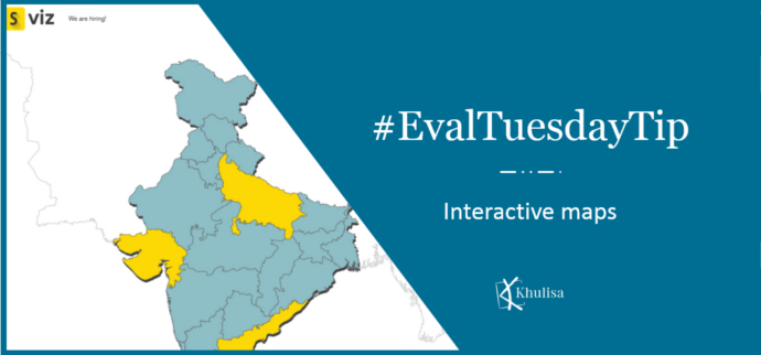
To visualize data geographically, Khulisa often uses SocialCops’ free interactive mapping tool: https://viz.socialcops.com/. It allows you to upload your data, choose a design palette and
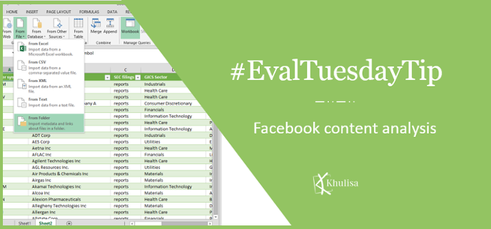
Do your indicators require social media data? Khulisa is currently using Power Query for an evaluation to analyze Facebook content, including the organization’s posts and
Do you want to start using indicators in your organisation, but are unsure of what to measure? Khulisa often advises organisations to refer to the