
#EvalTuesdayTip: Who to accept and reject on LinkedIn?
LinkedIn is a very useful social platform for evaluators – whether using it to secure new contracts, find resources or stay abreast of opportunities. Therefore,

LinkedIn is a very useful social platform for evaluators – whether using it to secure new contracts, find resources or stay abreast of opportunities. Therefore,
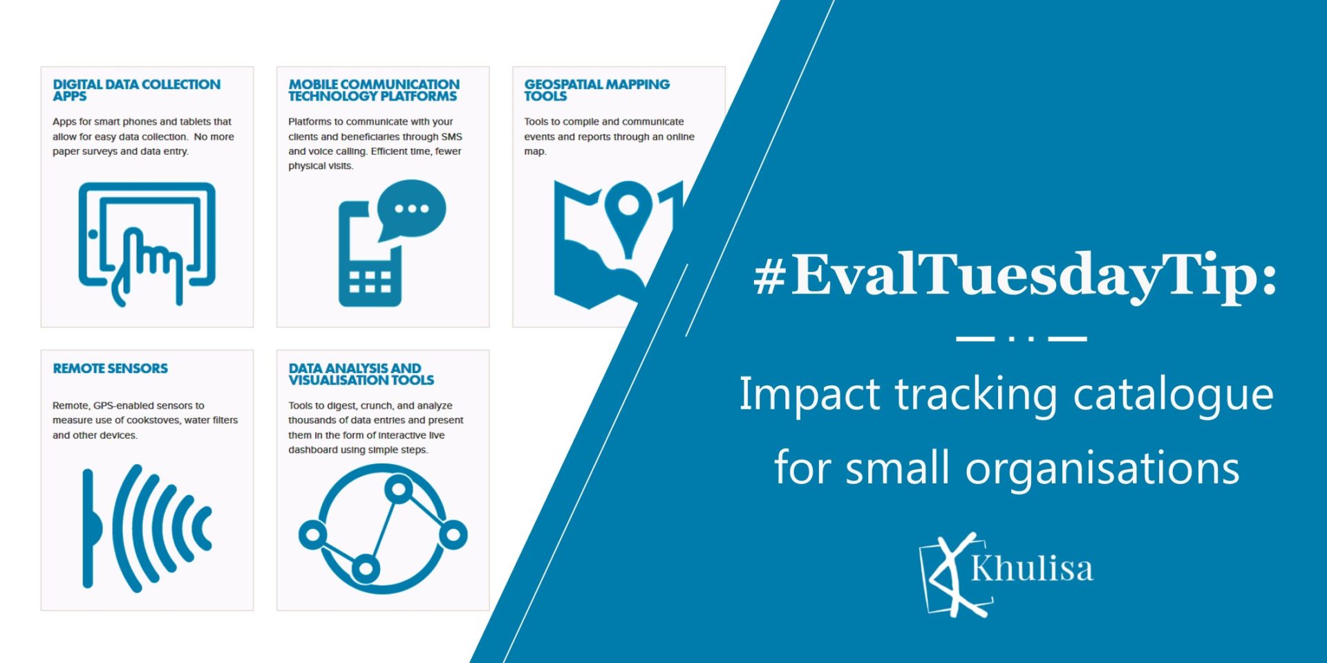
Khulisa likes this Impact Tracker Technology – a catalogue featuring various low-cost, technology-based tools that helps small- to medium size organisation to collect data, measure
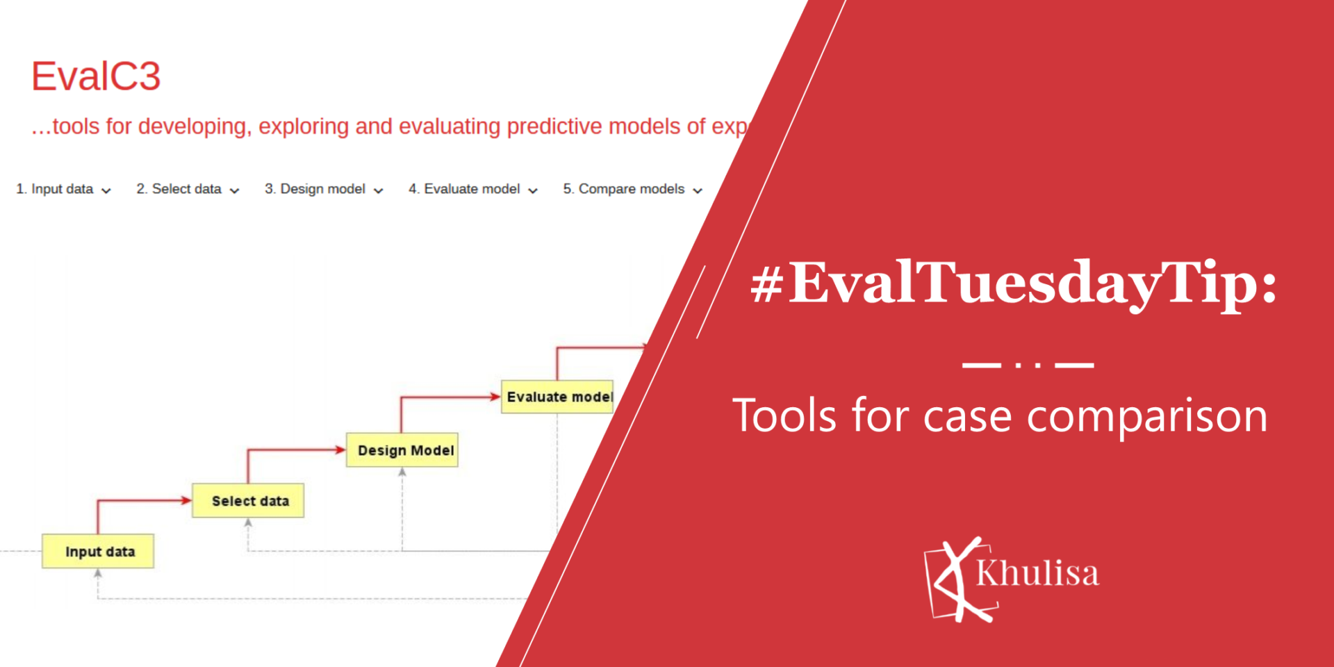
Qualitative Comparative Analysis (QCA) is a case-based method that enables evaluators to systematically compare cases to document impact. It was first identified by Charles Ragin
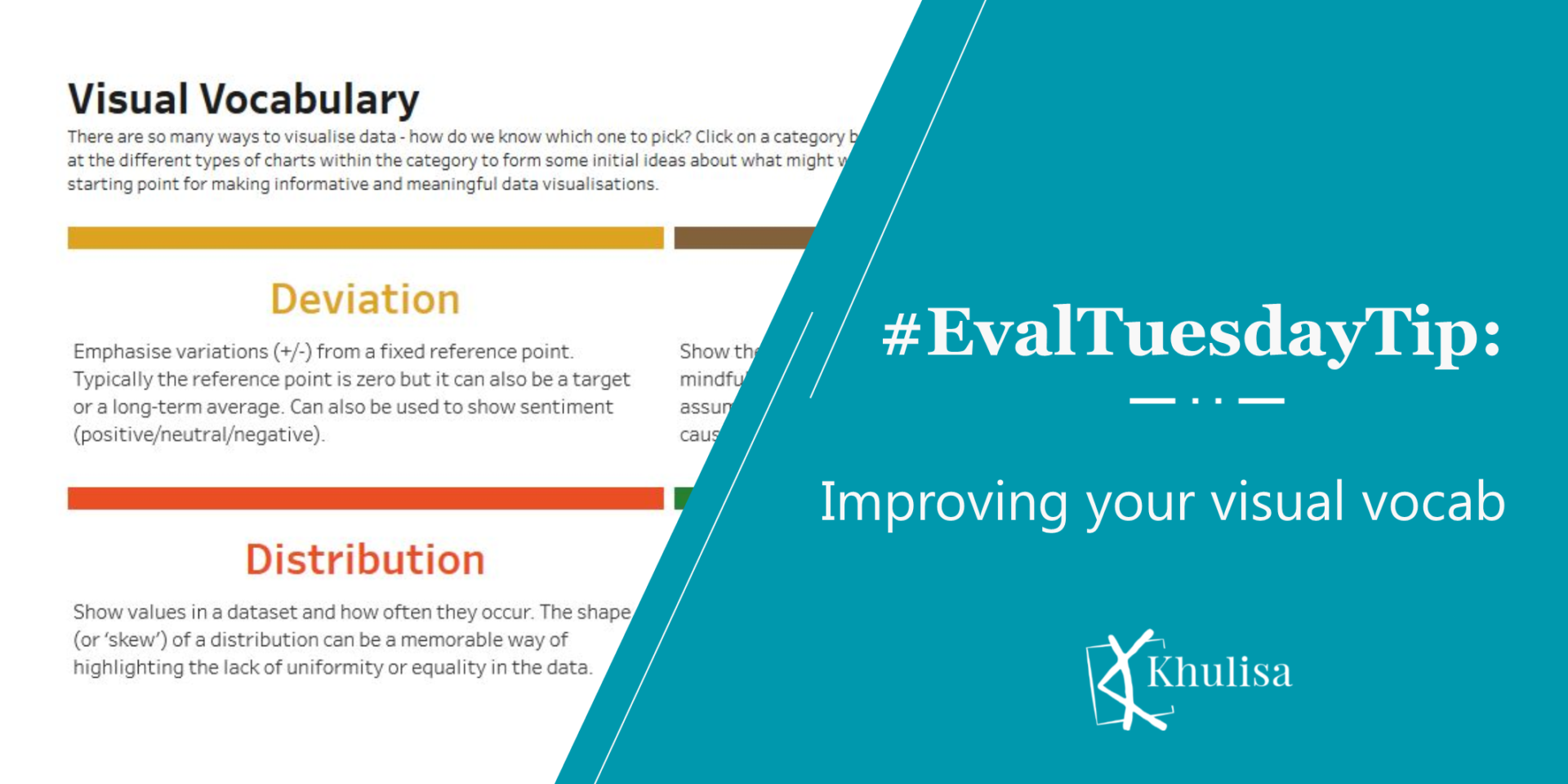
Are you staring at a datasheet wondering what would be the best way to visualise them? Khulisa discovered this excellent visual vocabulary by to help
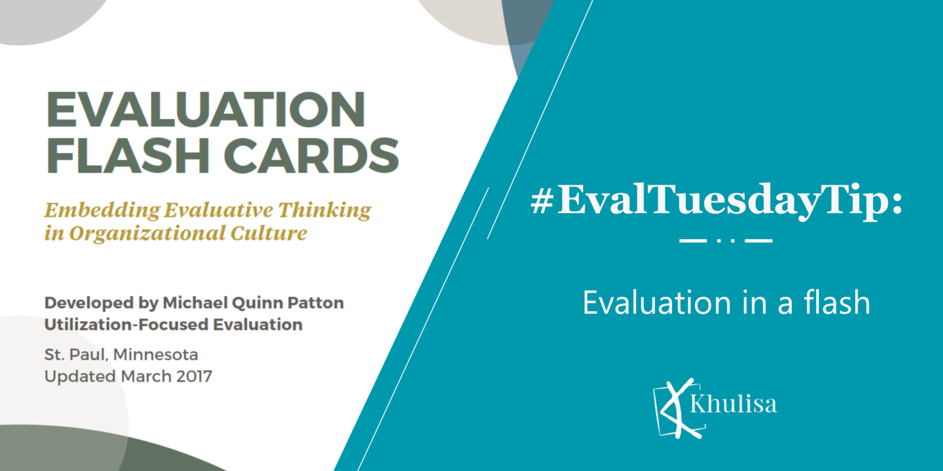
Michael Quinn Patton’s updated evaluation flashcards, developed for the Otto Bremer Trust, provide a great summary of all the steps you need when you’re developing
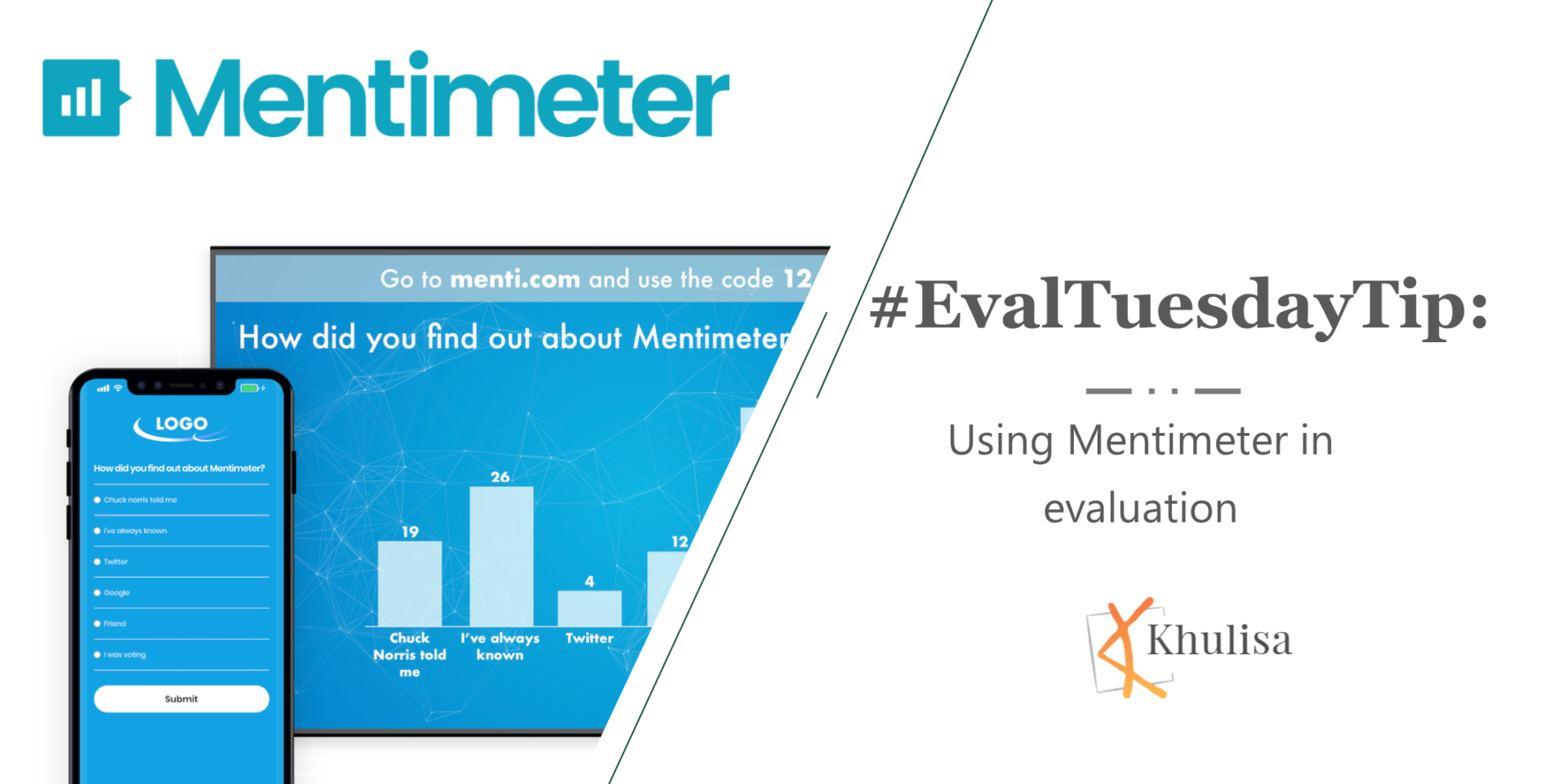
At some point in the evaluation process, an evaluator engages stakeholders to understand their expectations, validate the findings and agree on recommendations. Audience response
ISE4GEMs is a lengthy acronym for Inclusive Systemic Evaluation for Gender equality, Environments and Marginalized voices. And although it may sound like a mouthful, this
This is a great M&E resource from our evaluation friends in New Zealand. The Kinnect Group developed a guide to “building blocks in evaluation” collaboratively
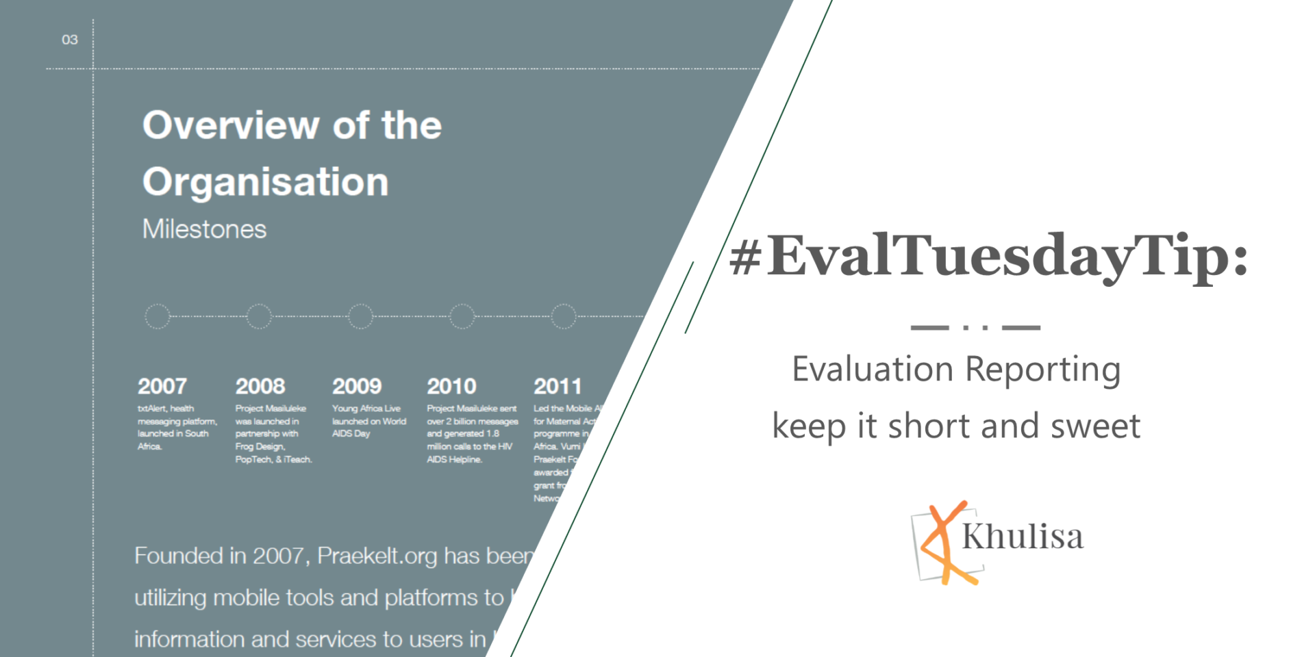
Khulisa loves looking at report examples for dataviz inspiration and to enhance evaluation utilization. The Praekelt Foundation’s 2017 annual report is a great example of
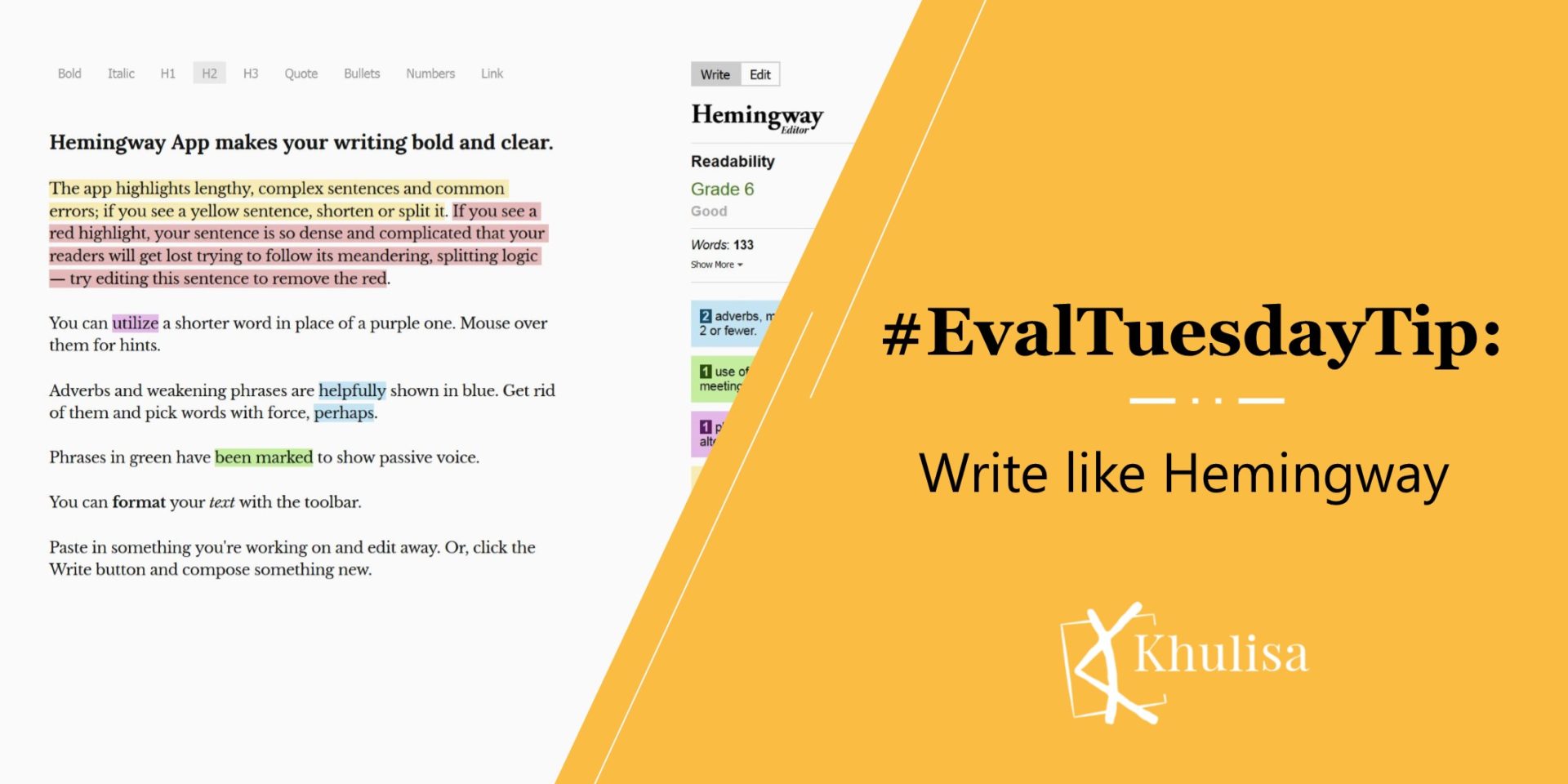
Evaluators often fall into the trap of using highly academic and complex writing styles that alienate audiences. The Hemingway app is a useful tool to